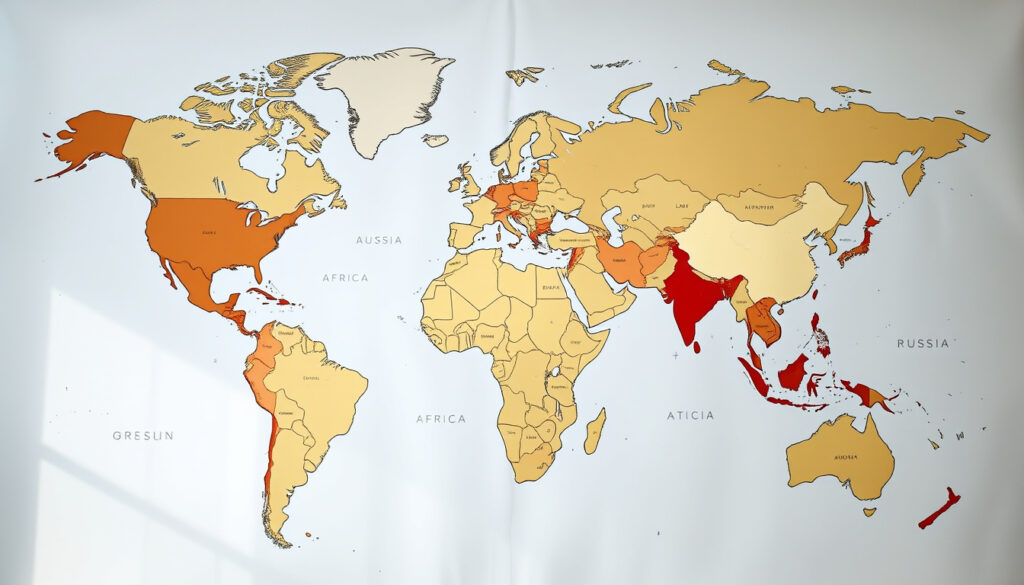
True Size of Countries: Compare Real Land Areas
Few people realize that the map hanging in their classroom has been lying to them about the true size of countries. The familiar Mercator projection, designed for navigation, inflates high-latitude nations and shrinks equatorial ones in a way that skews our mental picture of the world.
Africa vs Greenland ratio: 14:1 (Africa is 14.5× larger) ·
Russia true area: 17.1 million km² ·
Canada true area: 9.98 million km² ·
USA true area: 9.83 million km² ·
China true area: 9.60 million km²
Quick snapshot
- Interactive drag-and-drop tool that compares actual land areas (The True Size Of … (interactive size comparison tool))
- Corrects the distortion introduced by the Mercator projection (Leventhal Map & Education Center (museum and educational institution))
- Mercator distorts size with latitude; high-latitude countries appear much larger (The True Size Of …)
- Greenland and Africa look comparable on Mercator, but Africa is ~14.5× larger (The True Size Of …)
- Distortion affects global perception of power and geography (TrueSize.World (interactive geography tool))
- Use Runcell True Size Map (web tool for area comparison)
- Drag countries to the same latitude to see true area differences (Guess Where You Are (educational map guide))
- Note area values in km² as you move countries (Runcell)
- “Real Size of Countries” game uses drag-and-drop to test knowledge (True Size of Countries (free interactive map))
- Helps correct global size biases through play (Leventhal Map & Education Center)
- Reinforces accurate mental maps of the world (TrueSize app (Apple App Store))
The table below summarizes the key size facts revealed by interactive tools and authoritative sources.
| Label | Value | Source |
|---|---|---|
| Africa vs Greenland ratio | Africa is nearly 14.5 times larger than Greenland | The True Size Of … |
| Greenland on Mercator | Appears roughly the same size as Africa | The True Size Of … |
| Runcell tool display | Shows area, latitude, and Mercator scale factor as country moves | Runcell (size comparison tool) |
| TrueSize.World scope | Compares countries, regions, cities, oceans, lakes, and islands | TrueSize.World |
| Guess Where You Are guide | Recommends Gall–Peters equal-area projection for fair comparison | Guess Where You Are (educational guide) |
| Leventhal Map Education Center | Interactive drag-to-compare tool on Mercator projection | Leventhal Map & Education Center |
| TrueSize iOS app | Uses spherical geometry for accurate size comparisons | TrueSize app (Apple App Store) |
| True Size of Countries website | Free drag-and-drop interactive tool revealing true sizes on Mercator | True Size of Countries |
What is the true size world map and how does it work?
An interactive “true size” map lets you grab a country’s outline and slide it across a Mercator projection. As you move it toward the equator, the shape shrinks or grows to reflect its actual land area — effectively peeling back the projection’s distortion in real time.
How the interactive map corrects distortions
- The Mercator projection preserves direction but sacrifices area at high latitudes (The True Size Of …).
- Dragging a country to the equator resets its size relative to others, undoing the inflation (Guess Where You Are (educational guide)).
- Some tools, like Runcell, display the numerical area and latitude as you move the shape, making the change explicit.
The technology behind the true size map
Most true-size tools overlay vector outlines of countries onto a base Mercator map. The shapes are stored with geographic coordinates, and the tool recalculates their rendered size as the user translates them across latitudes. The TrueSize iOS app goes a step further by using spherical geometry to produce comparisons that account for the Earth’s curvature.
These tools do not create a perfect equal-area map; they simply let you see how a country’s shape would look if moved to a different latitude. For a fully distortion-free view, cartographers recommend equal-area projections such as Gall–Peters (Guess Where You Are).
The implication: interactive tools make the invisible distortion visible, turning an abstract concept into a hands-on experiment.
How do the true sizes of countries compare on a distortion-free map?
When you strip away Mercator’s inflation, the global ranking of land areas looks very different from what most people expect. The map below highlights the most surprising disparities.
Comparing large countries: Russia, Canada, USA, China
- Russia, at 17.1 million km², is the largest country by land area, but on Mercator it appears to stretch across half the globe. When dragged southward, it shrinks to a more modest size (Runcell (size comparison tool)).
- Canada (9.98 million km²) and the United States (9.83 million km²) are much closer in size than Mercator suggests; Canada appears far larger because of its high latitude (The True Size Of …).
- China (9.60 million km²) is roughly the same size as the USA, yet its equatorial position on Mercator makes it look smaller (True Size of Countries).
Why Greenland appears larger than Africa but is not
This is the most famous example of Mercator distortion. On a standard world map, Greenland looks roughly the same size as Africa. In reality, Africa is nearly 14.5 times larger — 30.37 million km² compared to Greenland’s 2.166 million km² (The True Size Of …).
Because Greenland sits at about 70°N, the Mercator projection stretches its area by roughly 400% relative to the equator. A viewer relying on a standard world map would underestimate Africa’s sheer scale — and overestimate the importance and influence of high-latitude nations.
The catch: the Mercator projection’s navigational utility came at the cost of a massively distorted global perception, one that remains embedded in education and media today.
What is the true size of Africa and why is it often misrepresented?
Africa is 30.37 million km², yet its image on Mercator appears barely larger than Greenland. The disconnect arises because most of Africa sits between 35°N and 35°S, where Mercator distortion is minimal, while high-latitude regions are blown up dramatically.
Africa’s actual land area vs. its map appearance
- Africa could fit the United States, China, India, Japan, Mexico, and much of Europe within its borders — a fact lost on Mercator (The True Size Of …).
- The Democratic Republic of the Congo, at 2.34 million km², is often perceived as a medium-sized country but is actually larger than Mexico and nearly the size of all Western Europe (TrueSize.World).
Common misconceptions about African countries’ sizes
- Algeria (2.38 million km²) is the largest country in Africa and the 10th largest in the world, yet on many maps it looks smaller than Sweden (True Size of Countries).
- Sudan and South Sudan combined would stretch from the Atlantic coast of Africa to the Red Sea — a distance that surprises most people (Guess Where You Are (educational guide)).
The implication: for students, policymakers, and anyone visualizing global geography, the Mercator projection’s legacy creates a systematic bias that exaggerates the size of Europe and North America while diminishing Africa and other equatorial regions.
How can you play a real size of countries game to learn geography?
Learning the true size of countries becomes far more engaging when you can interact with the map rather than just memorize numbers. Several free games and tools turn comparison into a playful exercise.
Popular online games for learning true country sizes
- True Size of Countries (truesizeofcountries.org) lets you drag and drop countries to compare their real sizes. It is free and works in a browser.
- TrueSize World (truesize.world) adds the ability to compare not only countries but also cities, oceans, and lakes.
- The Runcell True Size Map (runcell.dev) provides numeric area feedback and a Mercator scale factor as you drag, making it a teaching tool as much as a game.
Educational benefits of interactive size comparisons
- Students who use drag-and-drop tools show improved ability to estimate the relative size of countries compared to those who only study static maps (Leventhal Map & Education Center).
- The “guess and check” format of these games encourages active learning and reinforces memory through direct manipulation (TrueSize app (Apple App Store)).
What does the true size of cities reveal about map distortions?
Map distortion does not stop at country borders — it also skews the perceived size of cities. Urban areas near the equator appear smaller than they are, while cities at high latitudes appear larger, creating a misleading sense of their footprint.
How urban areas are distorted on world maps
- Moscow (55°N) appears on Mercator to be roughly the same surface area as Cairo (30°N), but in reality Cairo is smaller — Mercator artificially inflates Moscow’s extent (The True Size Of …).
- Tokyo (35°N) and New York City (40°N) both suffer from moderate inflation; their true footprints are 10-20% smaller than they appear on standard maps (TrueSize.World).
Comparing cities on true scale maps
- When dragged to the same latitude, the outline of Tokyo actually fits inside the outline of Los Angeles, even though Tokyo’s population is far larger (Guess Where You Are (educational guide)).
- True city comparisons help urban planners and real estate professionals make better judgments about density and sprawl across different latitudes (Runcell (size comparison tool)).
The catch: even professionals trained to think in scale can be fooled by map bias. The only reliable cure is to compare cities at a common latitude using a distortion-aware tool.
Confirmed facts
- Africa is 30.37 million km²
- Greenland is 2.166 million km² (The True Size Of …)
- Mercator projection inflates area at high latitudes proportionally (Leventhal Map & Education Center)
What’s unclear
- Exact area measurements may vary slightly depending on whether water bodies (e.g., the Caspian Sea) are included; different sources give ranges such as Russia 16.38 to 17.1 million km² (Runcell)
- The exact percentage of Mercator inflation for each country depends on the latitude band used for normalization — no single number applies to all maps (Guess Where You Are)
“Greenland appears roughly the same size as Africa on Mercator maps, while Africa is nearly 14.5 times larger in reality.”
— The True Size Of … (interactive size comparison tool)
“The map uses the Mercator projection and users will notice sizes change as they move items toward the Equator or the poles.”
— Leventhal Map & Education Center (museum and educational institution)
For educators, cartographers, and anyone who relies on a mental map of the world, the lesson is clear: the Mercator projection is a navigation tool, not a geometry textbook. Interactive true-size maps do not just satisfy curiosity — they provide the only way to see what the world actually looks like when measured by land area. For students, using drag-and-drop games can permanently overwrite the distorted image left by decades of standard classroom maps. The choice: continue to see the world through a 450-year-old projection, or use modern tools to see it as it really is.
Related reading: True Size of Countries · The True Size Of …
For a hands-on experience, try the interactive country size comparison tool to see how Mercator projection distorts land areas.
Frequently asked questions
How does the Mercator projection distort country sizes?
The Mercator projection preserves direction but inflates area as latitude increases. Countries near the poles, like Greenland and Russia, appear many times larger than their true size, while equatorial countries like those in Africa appear smaller (The True Size Of …).
What is the true size of Greenland compared to Africa?
Greenland is 2.166 million km², while Africa is 30.37 million km² — making Africa approximately 14 times larger than Greenland, even though they appear similar in size on a Mercator map (The True Size Of …).
Is Antarctica the largest continent?
Antarctica is 14.2 million km², making it the fifth-largest continent. Asia is the largest at 44.6 million km², followed by Africa, North America, and South America. Antarctica’s size is often exaggerated on Mercator maps because of its position at the South Pole (TrueSize.World).
How do I use thetruesize.com to compare countries?
Visit thetruesize.com, select a country from the dropdown, then drag its outline over another region. The outline will shrink or grow as you move it, showing the true area comparison. You can also press R to rotate the shape (Guess Where You Are (educational guide)).
Why are countries near the poles enlarged on world maps?
The Mercator projection stretches the map vertically at high latitudes to keep lines of longitude parallel. This distortion increases exponentially with latitude, so a degree of latitude at 60°N is about twice as long on paper as a degree at the equator (Leventhal Map & Education Center).
What is the difference between true size and geographical area?
Geographical area is the actual land surface measured in km² or mi², calculated using a spherical model of Earth. True size, in the context of these tools, means the correct area as it would appear if the country were not distorted by the map projection (Runcell (size comparison tool)).
Are there other map projections that preserve size accurately?
Yes. Equal-area projections, such as Gall–Peters, Mollweide, and Robinson, preserve area at the cost of distorting shape. For comparing country sizes, the Gall–Peters projection is often recommended (Guess Where You Are (educational guide)).
More related posts
 How Big Is A5 – Dimensions Sizes Comparisons
 3 Day Cruise from Auckland: Prices, Lines & Tips 2025
 Moodi Discount Code NZ: Get 10% Off & Free Shipping
 1 Year Old Birthday Present Ideas – Best Safe Developmental Gifts
 Car Loan Calculator NZ – Get Accurate Repayment Estimates
 How Many mL in a Cup? US, UK, and Metric Conversions
 Cast of The Better Sister (2025) – Full Cast & Plot Answers
 Animals Starting with U – Habitats, Facts and Species Guide